BRANDING
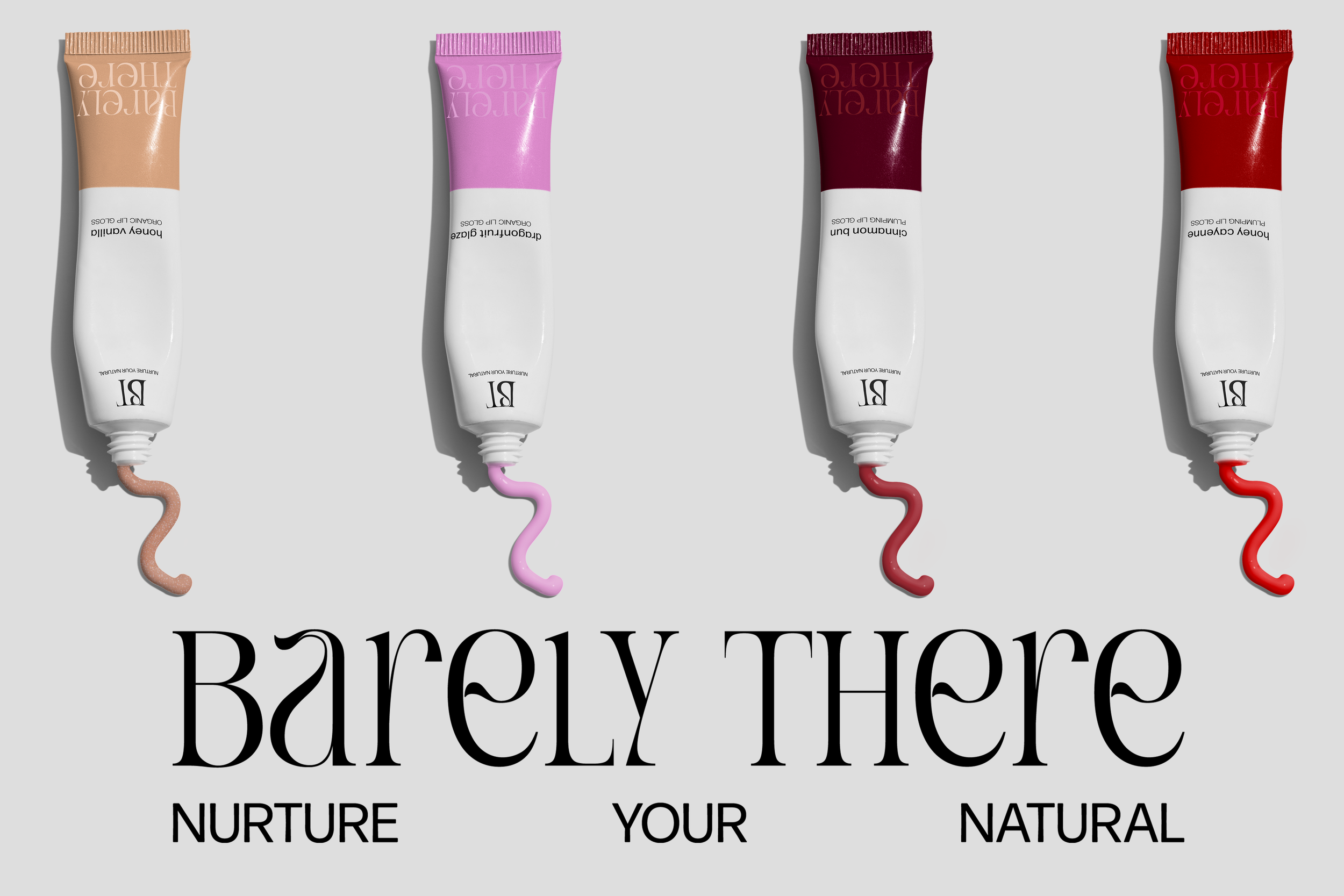
Barely There
Barely There is an Organic Lipgloss company, where we strive to marry beauty and nature as one. Since I was starting with a blank slate, I started with Logo Design, where I knew I wanted simplicity and elegance. I landed at the wordmark shown. I then took the same inspiration when creating the packaging designs and marketing materials, with the clean, sans-serif fonts, organic drawn assets, and bold imagery.
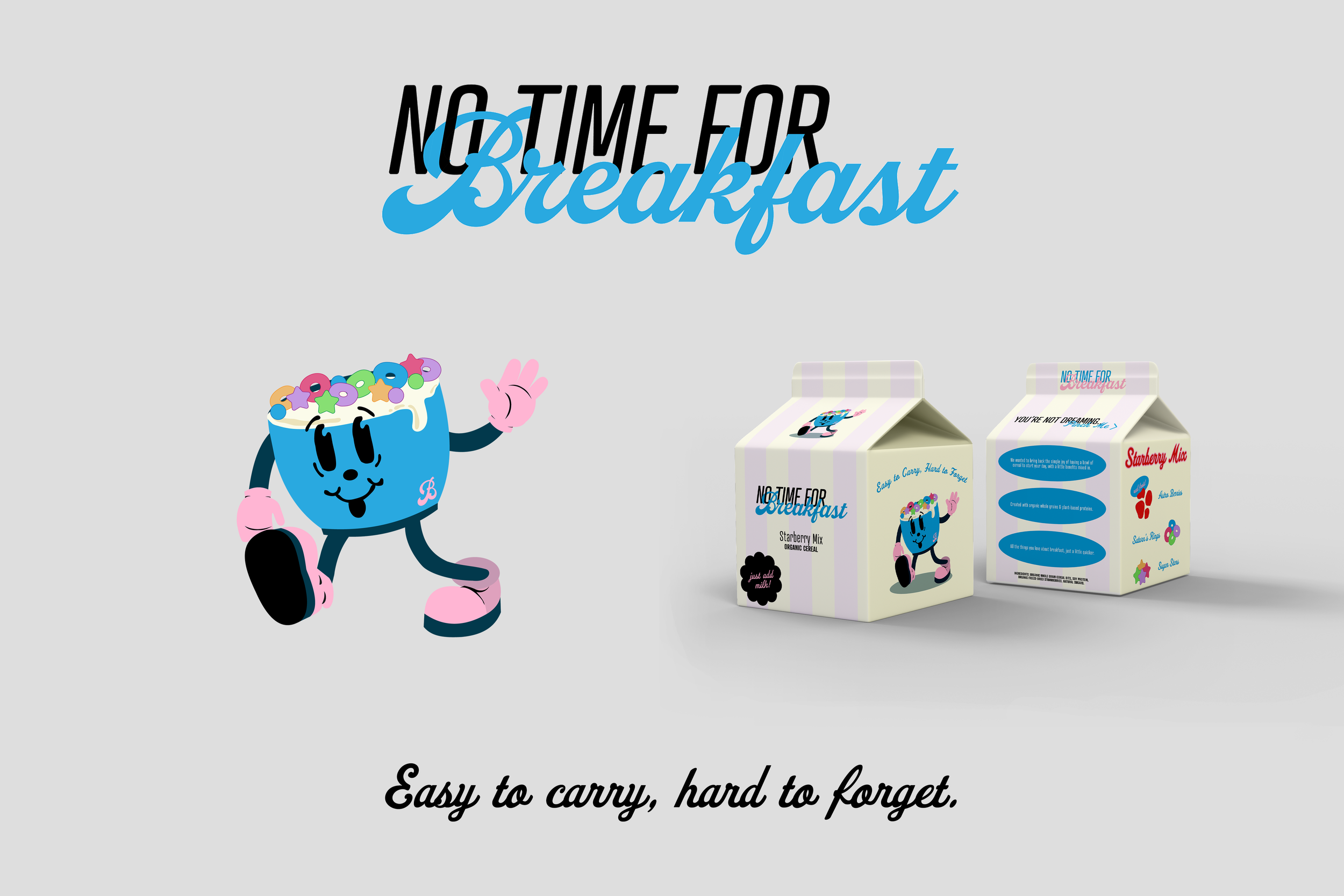
No Time For Breakfast
No Time For Breakfast is company for cereal on-the-go. With full creative range, I wanted to keep the brand’s look and tone playful and bright, with a nod to nostalgia. I created the mascot and wordmark to be used interchangeably amongst the various mediums (socials, packaging, etc.) Following that, I found the perfect mockup and designed the packaging to keep the same feel.