


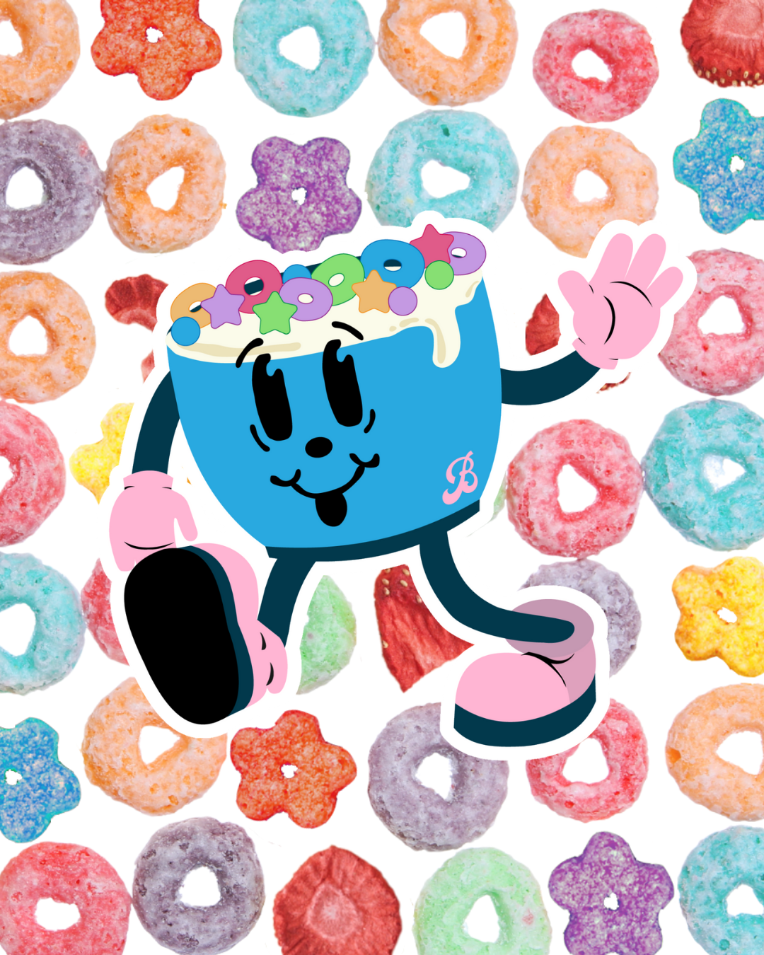
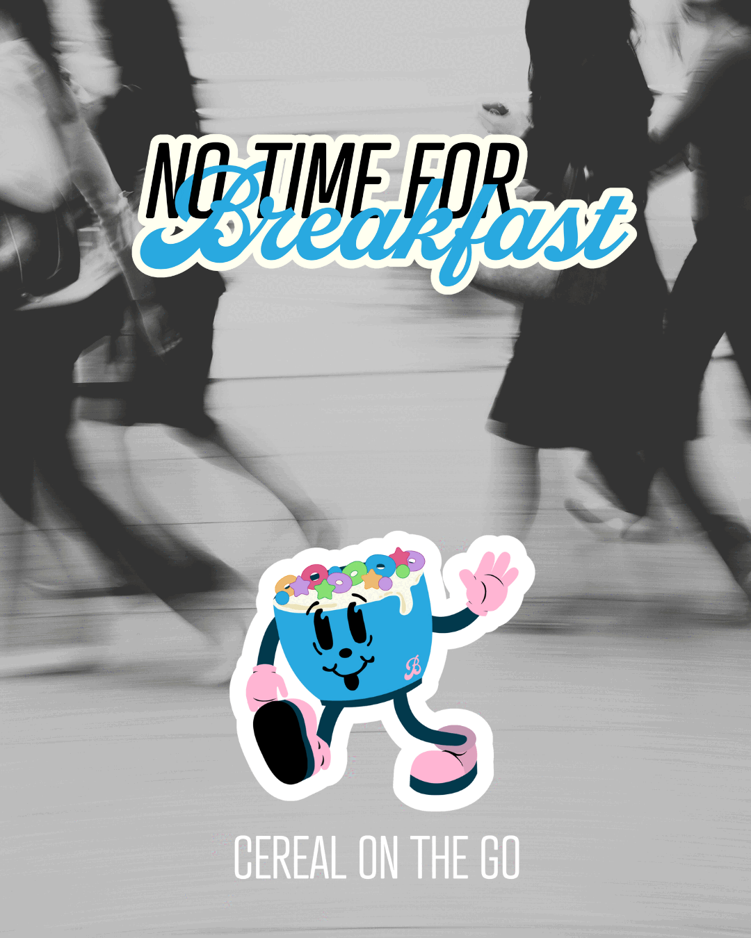
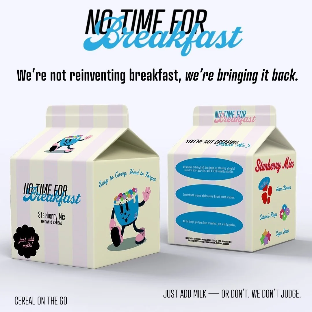
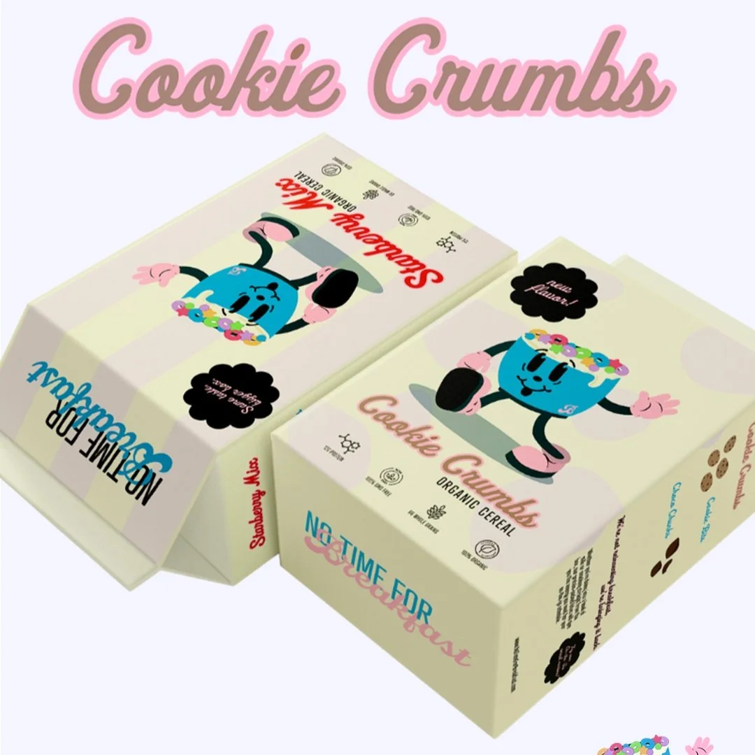
NO TIME FOR BREAKFAST
"No Time For Breakfast" started with the idea of transforming early breakfasts into something to look forward to. I I aimed to create a visual identity with emotional connection, drawing from the charm of classic cereal branding. After that, I sourced a packaging mockup that aligned with the look and feel I envisioned. I then developed the visual identity, incorporating bold colors, typography, and layout choices that feel both retro and modern. The result is a design that’s not only functional for on-the-go mornings but also taps into a sense of familiarity and fun. You can view the original prompt here.
A CEREAL ON-THE-GO COMPANY

BRANDING
╎
LOGO DESIGN
╎
PACKAGING DESIGN
╎
BRANDING ╎ LOGO DESIGN ╎ PACKAGING DESIGN ╎